Choice Lists
Use a choice list to present a selectable list of buttons to the user. A choice list can be added to any panel, but typically works best in the final panel of a sequence.
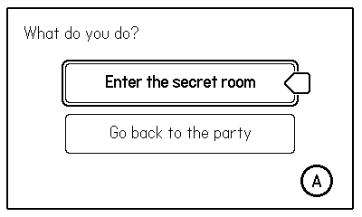
Each button in a choice list can set a target sequence and/or a value for a global variable. These can be used to alter the user’s path through a nonlinear comic or to conditionally render layers based on the user’s choices.
Table of contents
Properties
color
default: Panels.Color.BLACK
The foreground color to be used for the buttons in the list.
Options:
Panels.Color.BLACKPanels.Color.WHITE
x
default: nil
The horizontal position of the choice buttons (relative to the top left corner of the panel). If an x position is not set, the buttons will be centered horizontally within the panel.
y
default: nil
The vertical position of the layer (relative to the top left corner of the panel). If a y position is not set, the buttons will be centered vertically within the panel.
width
default: nil
The width of the buttons in the list. If no width is set, the buttons will auto-size to fit the longest button label.
height
default: nil
The height of each button in the list. If no height is set, the buttons will auto-size to fit the tallest button label.
borderRadius
default: 4
The corner radius of the buttons.
spacing
default: 6
The amount of space left between the buttons in the list.
fontFamily
default: nil
A table that defines the font family to use for the button labels. Buttons will display with bold text style when selected.
Example choice list with font family:
choiceList = {
  fontFamily = {
    [Panels.Font.NORMAL] = 'fonts/SasserSlab/Sasser-Slab',
    [Panels.Font.BOLD] = 'fonts/SasserSlab/Sasser-Slab-Bold',
  },

  buttons = {
    { label = "Open the door", target = "roomInterior" },
    { label = "Leave", target = "street" }
  }
}
If no font family is specified, the choice list will use the font family set for the current Panel or Sequence.
buttons
required
A list of the buttons that will appear in the list. See Button Properties below.
Example button list:
choiceList = {
  buttons = {
    { label = "Open the door", target = "roomInterior" },
    { label = "Leave", target = "street" }
  }
}
onSelectionChange
default: nil
An optional custom function that will be called when the currently selected button changes. Normal button properties can be used to set a target sequence and/or a variable value, but this hook can be used to run more complex logic.
The function should accept two parameters. The first is the index of the currently selected button. The second parameter is a table that holds the properties for the currently selected button.
Example:
local function onPanel2SelectionChange(index, button)
  -- log the current button label
  print(button.label)
end
buttonRenderFunction
default: nil
An optional function to take over rendering the buttons in the list. Use this if you want to alter the button appearance beyond what’s possible with the provided properties.
This render function should accept the following parameters:
label(string)x(number)y(number)width(number)height(number)borderRadius(number)fontFamily(font family table)selected(boolean)
Use these properties to draw the current button in your preferred style. Refer to renderChoiceButton in Panels/modules/ChoiceList.lua to see the default implementation.
Button Properties
label
required
The text to display on the button
target
default: nil
The id of the sequence to set as the next sequence when this button is selected.
The comic won’t actually advance to this target sequence until the user presses the advance control input for the sequence.
var
default: nil
Specify a variable (key and value) that should be set when this button is selected.
Note that the variable is set immediately upon button selection. You’ll most likely want to specify the same variable (with different values) for each button, so only the most recent change remains in effect when the sequence transitions.
Example:
choiceList = {
  buttons = {
    { label = "Pick up the food", var = { key = "hasFood", value = true} },
    { label = "Leave it", var = { key = "hasFood", value = false} }
  }
}
selected
default: nil
Set one button in your list as selected to have it be selected by default. If not set, the first button will be the default.
Pointer Image
The image for the pointer arrow is located at Panels/assets/images/. You can replace pointer.png with your preferred image.